3 Rules of good emails (And boring email mistakes to avoid)
Follow these rules to make your B2B emails work.

Boring emails make your subscribers take the action ASAP - and that action is to unsubscribe and forget you exist.
So many B2B marketers and founders write bad emails. Then complaining that “Email doesn’t work”
If you want to market your SaaS or any kind of B2B business - avoid these 3 mistakes:
1. Your emails are not billboards or magazine ads
B2B isn’t consumer ecommerce.
People didn’t sign up to your list for 10% discount codes.
Stop sending only straight promotion, “hot deals”, 10 “sales end today” bumps.
Give before you ask.
The most common reason for someone to proactively join your company newsletter is educational value. For example you promised them some resource (like a guide) and then they stayed for continuous education: lessons, tips, mistakes, news.
People want to open and read that. And these emails include your product promo naturally.
Typical (bad) B2B emails instead look like this:
- “Come to our webinar” (without any context and valuable packaging)
- “We offer bespoke cutting-edge solutions” (like a billboard ad with questionable performance)
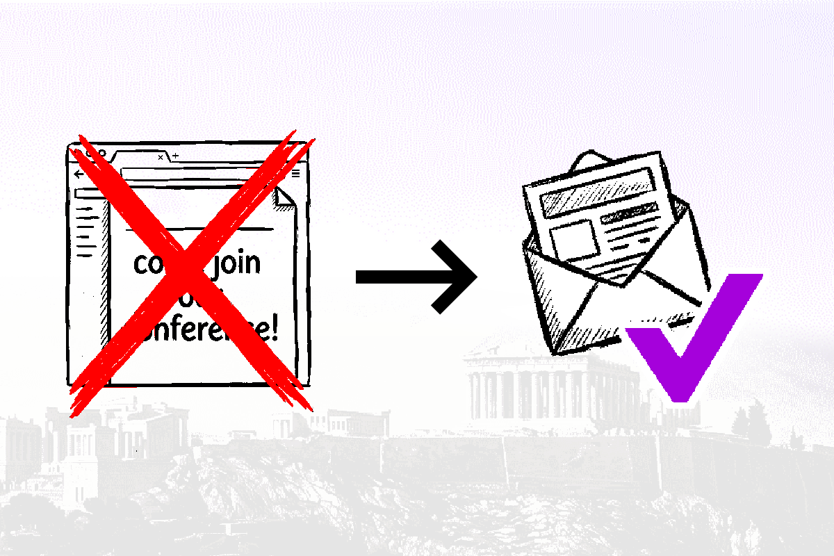
- “Come join us at the Event” (sent without any regard to reader’s location)
2. Invites must look like pain or value
Webinars, live streams, workshops, fireside chats, any events like these - can be ULTRA valuable.
Yet people wrap event invites in the worst way imaginable - lazy BORING direct invite, repeated a few times. Again, with no context.
Instead, hook readers with:
- painful problem
- big opportunity
- or relatable question
Start with WHY. Then frame your invite as the no-brainer solution.
Test it against your direct-invites-only campaign and you’ll see a world of a difference.
Tired of sending emails that don’t work? Subscribe for mini-guides that 10x your emails:
3. Emails are not books / blogs / contracts
Giant paragraphs. Zero room between ideas. Formal wording that looks like legal speak. No skimmable sections. No formatting.
It’s impossible to read. Good emails don’t look like that.
Good emails are either short or otherwise very reader-friendly:
- no walls of text
- bullet points or lists
- variable sentence length
- variable paragraph length
- clear sections and spaces between them
You’re not optimizing for SEO algorithms, social feeds, publisher’s preferences - you literally have almost total freedom to deliver your lessons, insights, opinions, all while leading to your product or offer.
But this means optimizing for something different - your reader.
Bonus tip
Fancy design can’t fix a boring email. If fact it makes it worse. Some marketers might disagree with me, but I think design can make even a good email worse. Because it takes away attention from the text (which is the most important part in 99% of the cases). Highly designed emails are often bloated so much, that you skip them even if the subject line made you REALLY interested. It’s just that hard to read.
Same thing applies not just to design, but to text bloat too - when 1 email tries to be 10 emails, it fails at each.
Did you ever subscribe to any company updates? Did their emails look like that? Let me know at leon@internetisdead.net