
5 Website tips to follow and 5 website mistakes to avoid

You have a website.
Basically every startup has a website.
But is yours nearly as good as it can be?
Your business is a collection of revenue-making assets, operational systems, and people who manage that. Website is one of these assets. But when done incorrectly it becomes a liability instead.
This article is for operators in teams who have working products and are looking to scale (not in stealth mode).
If you want to grow, you need to make your website better
I’m not talking about design (although it can be important), and I’m not talking about fancy features and animations (that’s not important, don’t do that).
I’m talking about optimizing for trust and decision.
Good website is a hub of resources and answers that your buyers need (and at scale - your potential employees and partners need).
1. Optimize for trust
Optimizing for trust means you look professional and not a scam.
You establish yourself as the authority in the space you’re in.
Your content is not slop. You have a point-of-view and arguments/stats to defend it.
You’re not afraid to present and pitch your product, but you respect the customer and you focus on them, not you. Answer questions that people often ask. Show them proof and visuals.
Their problems and opportunities come first, your solutions and stories come right after.
2. Optimize for decision
Optimizing for decision means you’re not overwhelming people with options, but also not hiding your CTAs.
Present your product as the right fit for their situation. Do it with the lowest friction for your target buyer/user.
Make it easy to take the next step.
Website don’ts:
- Don’t try to sound smart. Heavy jargon language is terrible for your conversions.
- Don’t look like Times Square x100: Overwhelming animations, nested menus, walls of text, everything’s flashy and competing for attention - that’s how you make a losing visitor flow.
- Don’t hide your proof. Every logo you can share, every good review/testimonial/result - these are some of the most important parts of your website (and your entire media ecosystem).
- Don’t skip the technical side. If your site is awfully slow - your conversions will be awfully low.
- Don’t look vibecoded.
Website do’s:
- Show WHY what you do matters to the visitor (their problems and/or opportunities). Whenever possible - describe what results they can achieve.
- Show HOW they can achieve it. What your product is and how it works. How much time and effort will it take to use it. How the pricing is structured.
- Use CUSTOMER’S language. Use words that they use, not words you heard from YT guides. Your best source of this info - talking to them. Number 2 source - their posts on forums, subreddits, social media.
- Have a direct CTA (meeting, demo, checkout) and a low friction CTA (some resource in exchange for their email).
Majority of your visitors aren’t ready for the first one yet, but they will be ready later. If you don’t capture their information, you will not be able to contact them easily.
That’s how you grow your owned media distribution channel. People from your audience and network who gave you direct permission to send them emails, both educational and promotional.
- If your target audience is 18-30 yo - consider adding Discord alongside your social links (e.g Linkedin, X). You can’t even imagine how many successful people are hanging out there.
Landing pages
Are crucial for good conversions.
I’ll write more about them in a dedicated article, so join if you haven’t yet.
The most crucial piece of info about them:
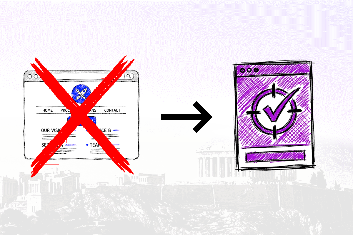
Don’t send your traffic (especially from ads) to your homepage. Send it to landing pages.
The only exception to that is if your homepage IS built like a landing, which is the case for some savvy startups.
Noticed anything that your website has? Let me know what you’re going to change: leon@internetisdead.net