
Case study: a16z-backed B2B SaaS websites homepage tactics

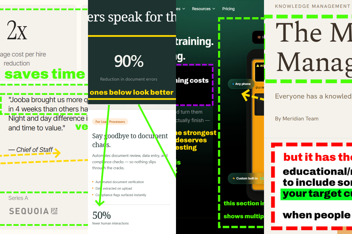
I analyzed 3 startups funded by a16z so you can copy tactics they use on their websites (and implement fixes I noted)
My highlights are not criticisms. I like these companies.
Quinn - "stole" my idea!
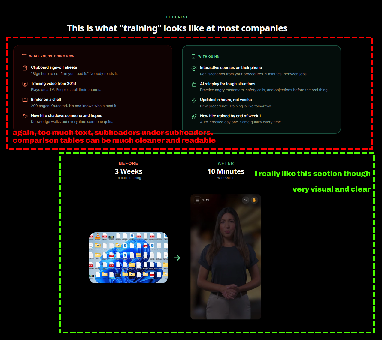
Quinn is one of the most interesting products I’ve seen in AI startup space - they turn boring documents into visual training for workers.
(tbh I had a similar idea myself...)
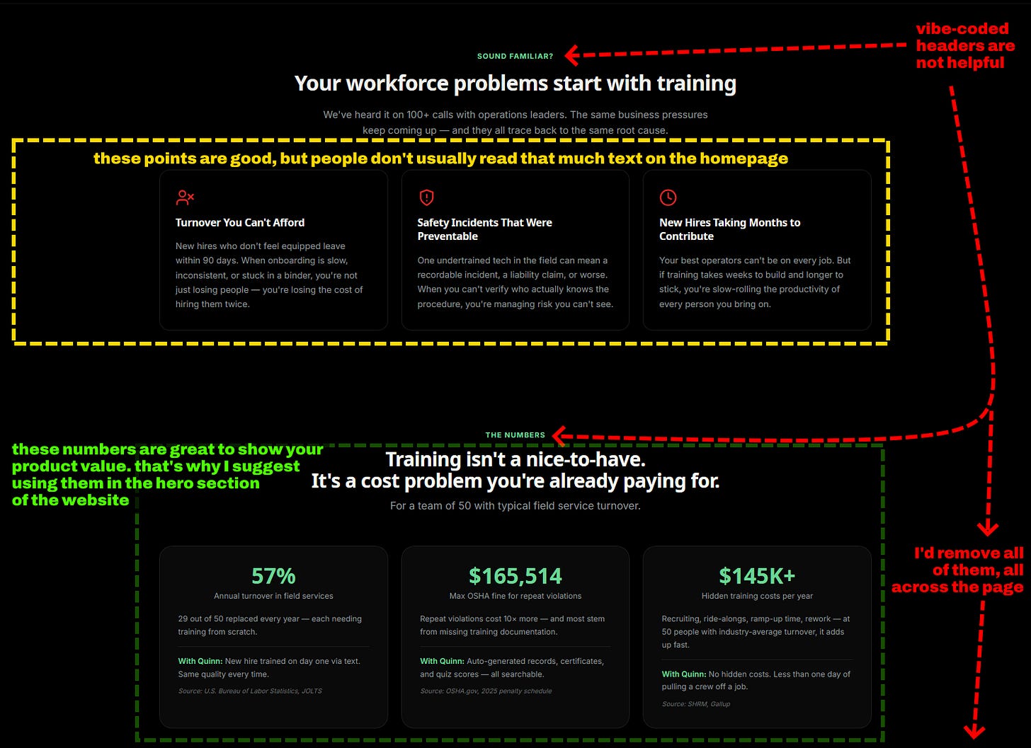
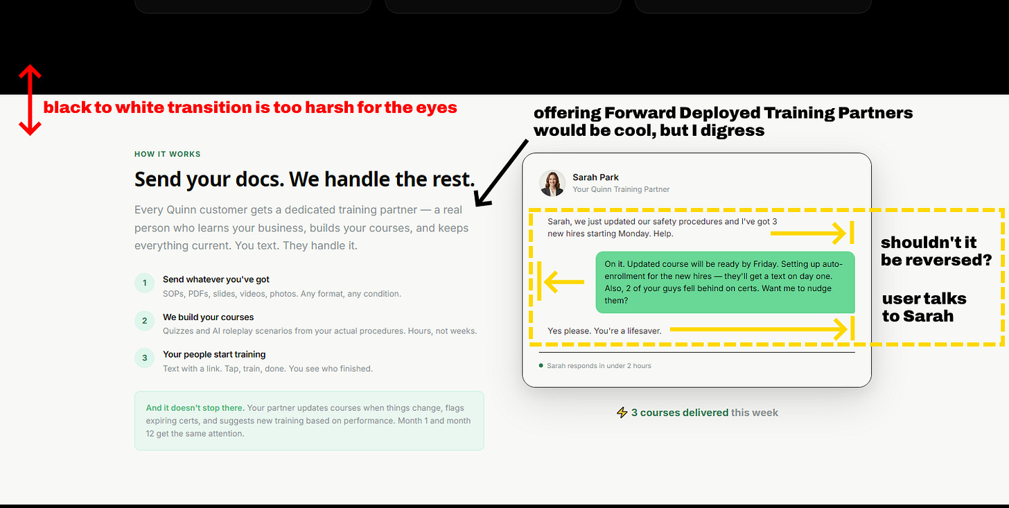
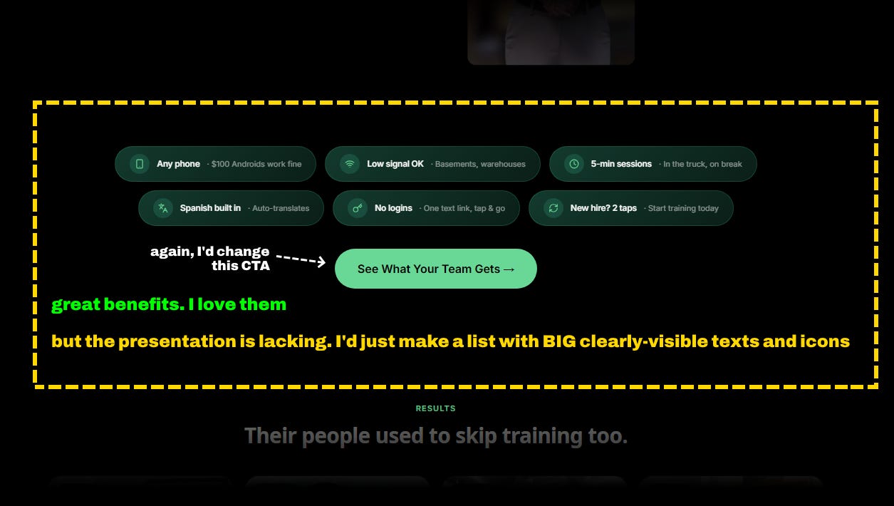
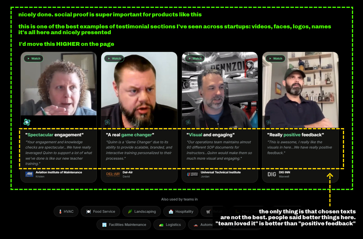
Here’s what Quinn did AMAZINGLY on their website, and what areas they should improve:
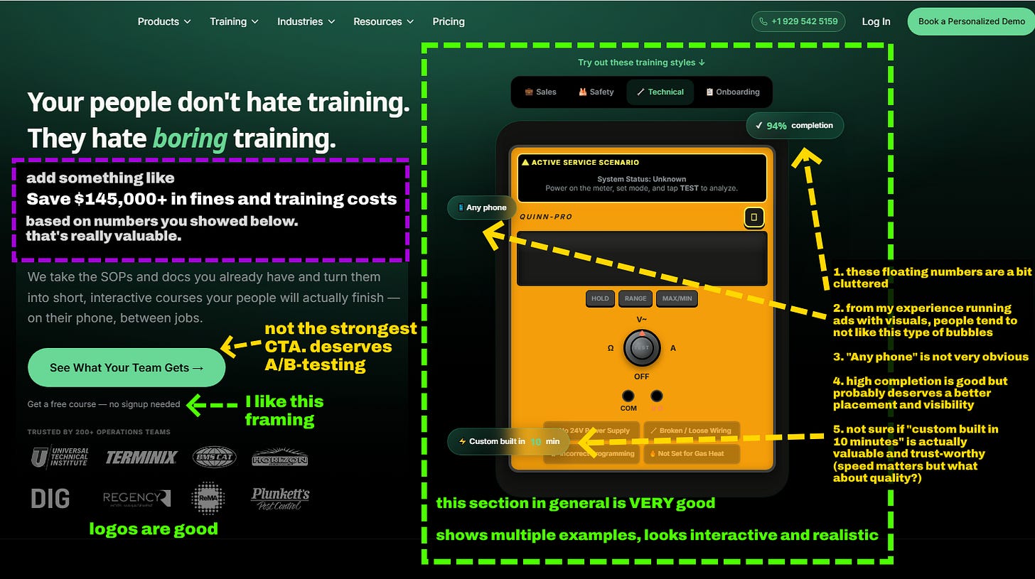
Their new homepage is very different to this one, looks much more similar to sites in physical industries. This old homepage is still worth exploring, especially if your customers are in digital industries.
Want to 10x your inbound pipeline? Book a free consultation
Meridian
Meridian helps consultants turn project knowledge and data into deliverables with AI.
Their website is pretty unique. Minimalistic but stylish, with some design elements that you don’t often see.
But there’s always room for improvement,
To scale their inbound marketing, I’d fix these first:
- show more interfaces, because people love familiarity and visuals
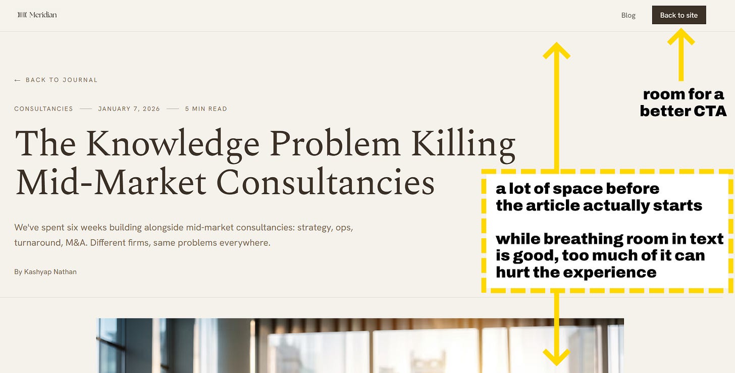
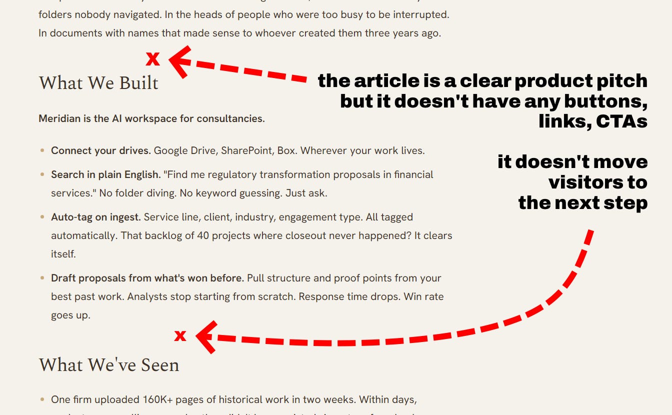
- add visually distinct CTAs in blog articles and optimize design a bit for better UX
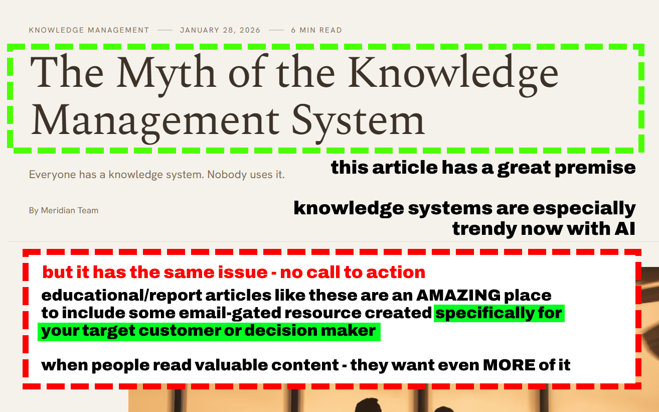
- create a low-friction CTA alternative to demo. I’d create a specific guide on turning knowledge into deliverables in 10x less time (7-day value-packed email course). Consultants read and use reports constantly, they are okay with giving their email in exchange for something useful
That’s how you 5x your demos and users.
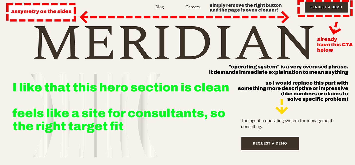
Note: their hero section has been changed and is currently much cleaner and symmetric.
Blog deserves some tweaks:
Typically <3 percent of visitors are ready to book a demo. And even they still need answers to questions, to increase the probability of them actually checking it and moving forward.
So besides direct demo CTA, add an option to capture their emails and have an automated backend selling system handling the conversion from lead to demo to customer. By offering an email-gated resource promising something valuable specifically to your target customer/decision maker.
This approach has 20-60% optins (compared to typical 1-5% most companies see) and up to 80-90% email opens in a sequence which is very high.
Want more breakdowns like these? Join:
Jooba - how to show your value and reviews
Jooba helps companies hire people using a specialized AI agent that lives inside Slack.
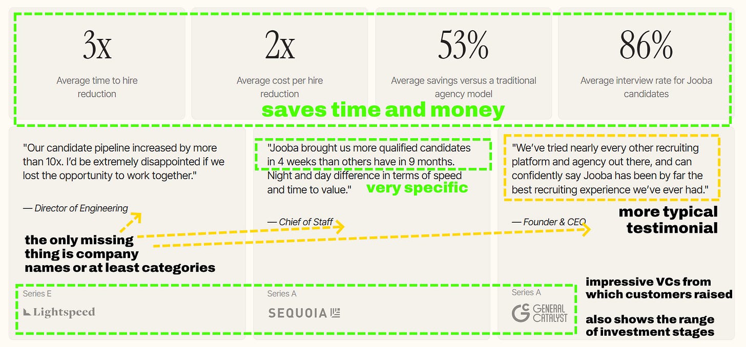
Their homepage is an awesome example on how to show your product’s value with numbers and reviews:
AI startups often try to solve everything (calling themselves “operating systems” and whatnot)
Founders think that since AI unlocks so many different possibilities, they should package and provide as many of them as possible.
But outside of frontier labs and OSS repos, successful AI products are the opposite of that. They deliver SPECIFIC results (for real workflows, JTBD, actual problems), not random all-in-one tools and superagents.
Jooba has a clear value proposition and shows impressive numbers and reviews RELATED to it.
While typical vibecoded startup website will give you 3-6 random stats without ever explaining what they actually help you achieve (and how)
Note: website audits were made in June 2026.
P.S. Did these examples inspire you to change something in your business? If you want to implement these ideas and 10x your inbound marketing - book a meeting