
Case study: Should you use only 1 call-to-action?

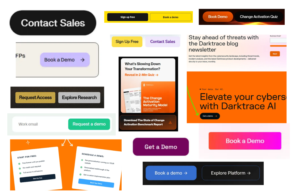
I hate website menus with tons of options, sections, confusing “navigation”
They aren’t designed for people. That’s obvious.
But what’s NOT obvious is whether you should always give just 1 option.
TLDR: in general you’d want to test this:
- for Marketing-led homepage - use 1 direct CTA (signup)
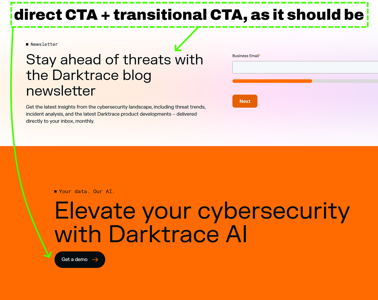
- for Sales-led homepage - use direct CTA and transitional CTA
- for Marketing-led dedicated pages and lead magnet landings - use 1 lead magnet CTA (signup can be secondary)
- for Sales-led lead magnet landings - use 1 lead magnet CTA (fast-track can be secondary, but test it against 1 CTA)
- for ANY blog - choose by relevance for specific search intent. Always show signup/contact CTA somewhere (e.g. navigation)
And if you want less competition between direct and transitional CTA - put secondary one in the footer.
Most sales-led companies simply want you to book a demo (1 direct CTA):

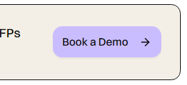


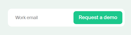
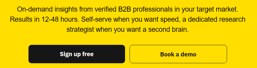
But some companies show that there’s another way:
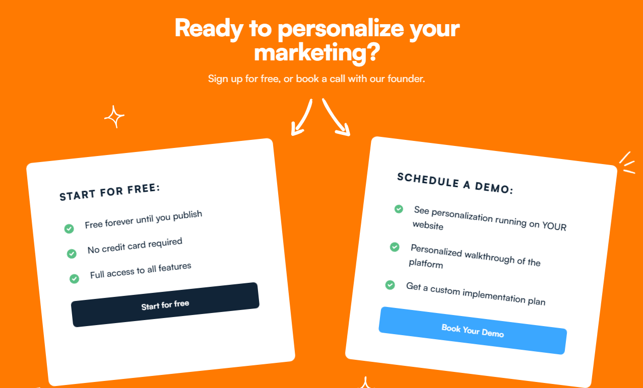




People who talk about conversion optimization and landing pages often stick to offering 1 CTA, 1 button, no options.
But plenty of visitors are open to one of your options, while totally closed to another. And plenty will even choose BOTH at the same time.
Offering just 1 option may reduce cognitive load and friction of choice. But it can also lead to bounces if visitors don’t see what they are looking for.
So, what to use?
Traditional websites are different from conversion-focused landing pages. It’s much more normal to have multiple options on your site, but just 1 on your landing.
In fact, many paid ads would’ve performed MUCH better if not for poor execution of the landing page. Visitors have no idea what to do if you show them too much.
If your ad leads to a specific offering - show that offering. Don’t add distractions.
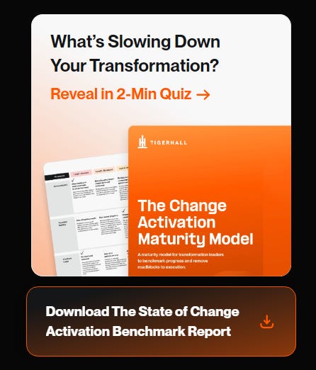
One exception that can work is a fast-track in lead magnets. For example: your ad leads to an educational email course about a specific problem. You’re asking for person’s email, that’s it. But as a secondary option to solve this problem, you present your demo/call/product. It can be tested on the same exact page, on Thank you page, in emails (first/not first).
For sales-led B2B (high-touch/services), websites often serve a different purpose. They aren’t “converting” or “selling” directly.
Website serves as your resource hub and trust layer:
- Contacts
- Social proof
- Documentation and support
- Links to reviews and other credibility assets
- Comparisons with competitors
- Thought leadership and POV
In this case, offering more than 1 CTA is GOOD. Because you’re already covering multiple customer stages and levels of intent.
Really, it’s almost purely a question of your time/resources. You will almost certainly benefit from adding gated resources (and if you don’t have time to make them - email leon@internetisdead.net and I’ll help)
So: Your primary CTA is still a demo/contact. Additional (transitional) CTA is a resource, free tool/service, or an email course.
Pro tip: you often see newsletters as the second option. Most of the time they’re a bad second option. Test something from the list above instead.
For marketing-led B2B (self-checkout/products), a website is a mix of both worlds. The goal is to convert directly. BUT since there is no Zoom conversation - you need to present additional collateral to increase the chances of conversion:
- Clear pricing
- What the product does
- How it helped someone
- License, cancellation, compliance, and other common objections
- Same resources as for sales-led: Social proof, articles, comparisons, documentation
If you have a trial or freemium option - it’s already a lead magnet by itself. Adding competing gated resources can be trickier than in sales-led sites.
It makes sense if you build dedicated pages that you promote through organic social, video, SEO. Example: tools, calculators, templates. You have someone’s email -> you can naturally nudge them towards your core product.
You probably wouldn’t want them on your homepage, competing with a signup.